Back to Projects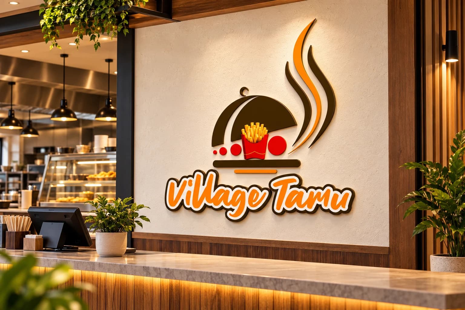
Logo Design / Visual Identity / Restaurant Branding / Food Service Branding
Village Tamu | Restaurant Logo Design Kenya
- Client
- Village TamuFood Service and Hospitality Brand
- Industry
- Food Service and Hospitality
Task
Demonstrate how a food-service identity can remain recognizable across restaurant signage, staff apparel, takeaway packaging, menu materials, and dispatch operations.
Client and industry overview. This restaurant logo design Kenya case study examines Village Tamu, whose visible identity combines a covered serving dish, fries, circular accents, rising steam lines, and an orange script wordmark.
Objective. This restaurant identity study tests whether the existing mark can stay legible across environmental, wearable, packaged, stationery, digital, and operational applications relevant to a food-service setting.
Design rationale. The serving dish, fries, and steam shapes provide direct hospitality and food cues, while the circular accents create a visual path across the symbol. The flowing wordmark adds an informal, approachable character below the compact illustration.
Color and typography. Orange provides the main visual energy and reinforces the warm food-service presentation. Deep brown anchors the serving-dish and steam forms, while red gives the fries carton and circular details a clear focal contrast. The script lettering remains the most distinctive typographic feature.
Applications. The brand applications cover restaurant signage, staff apparel, takeaway packaging, menu and digital materials, and a delivery operations bag.
Categories. Logo design, visual identity, restaurant branding, food-service branding, and brand identity design Kenya.
The identity in use
Brand identity across different applications. Select an image to explore the details.
Build on this work
Need this kind of design for your business?
Review the relevant service scope, starting prices, process, and deliverables before requesting a project quote.
Graphic Design Services in Kenya
Explore graphic design services, prices, deliverables, and the process for starting a project.
Explore serviceLogo Design in Kenya
Compare logo-design packages, revisions, source files, and brand-guideline options.
Explore serviceBrand Identity and Branding Services
Build a consistent identity across logos, colours, typography, packaging, stationery, and digital assets.
Explore serviceLet's CollaborateGot a project?
Got a project?
Let's talk.
We're a creative studio who are excited thrilled about distinctive design ideas and helping businesses to create amazing brands by creating top-notch designs and solutions.