Back to Projects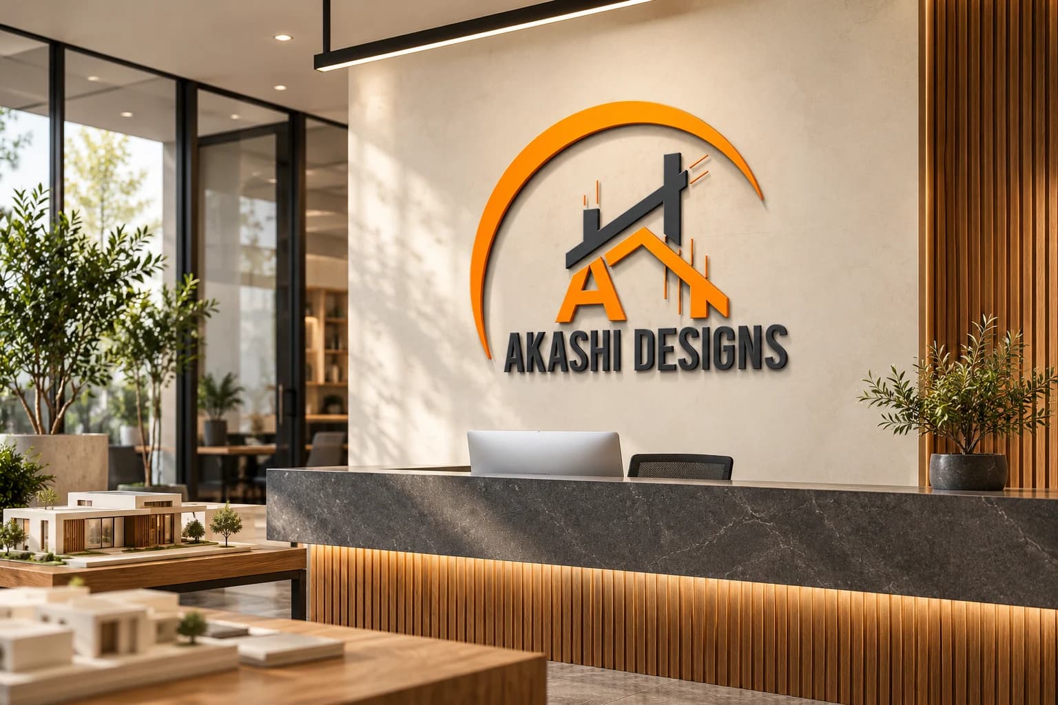
Logo Design / Visual Identity / Architectural Branding / Built Environment Branding
Akashi Designs | Architectural Logo Design Kenya
- Client
- Akashi DesignsBuilt Environment Design Brand
- Industry
- Architecture and Built Environment Design
Task
Demonstrate how a built-environment design identity can remain recognizable across studio signage, professional apparel, material presentation, proposal materials, and practical site operations.
Client and industry overview. This architectural logo design Kenya case study examines Akashi Designs, whose visible identity combines an orange crescent, a stylized letter A, roof and cityline forms, and a silver uppercase wordmark.
Objective. This brand identity presentation tests whether the existing mark can stay legible across environmental, wearable, packaged, stationery, digital, and operational applications relevant to a built-environment design setting.
Design rationale. The roofline, structural beam, and vertical city cues create a compact construction and design signal. The surrounding crescent gives the composition a clear outer silhouette, while the wordmark provides a stable readable base.
Color and typography. Orange carries the strongest visual emphasis and contrasts with the silver structural elements and uppercase lettering. The condensed wordmark supports the tall geometric symbol and remains readable when the complete mark is given enough space.
Applications. The brand applications cover studio entrance signage, professional apparel, a material sample case, proposal and digital materials, and a site equipment case.
Categories. Logo design, visual identity, architectural branding, built-environment branding, and brand identity design Kenya.
The identity in use
Brand identity across different applications. Select an image to explore the details.
Build on this work
Need this kind of design for your business?
Review the relevant service scope, starting prices, process, and deliverables before requesting a project quote.
Graphic Design Services in Kenya
Explore graphic design services, prices, deliverables, and the process for starting a project.
Explore serviceCompany Profile Design in Kenya
Create a professional company profile, proposal, annual report, or tender-ready business document.
Explore serviceLogo Design in Kenya
Compare logo-design packages, revisions, source files, and brand-guideline options.
Explore serviceLet's CollaborateGot a project?
Got a project?
Let's talk.
We're a creative studio who are excited thrilled about distinctive design ideas and helping businesses to create amazing brands by creating top-notch designs and solutions.