Loading Project
Back to Projects
Logo DesignVisual IdentityMinistry BrandingFaith-Based Organization Branding
Burning Bush Ministries International | Church Branding Kenya
ClientBurning Bush Ministries InternationalFaith-Based Ministry Identity
IndustryFaith-Based Organization
Task
Demonstrate how a faith-based identity can remain recognizable across ministry signage, volunteer apparel, welcome materials, information folders, digital presentation, and event operations.
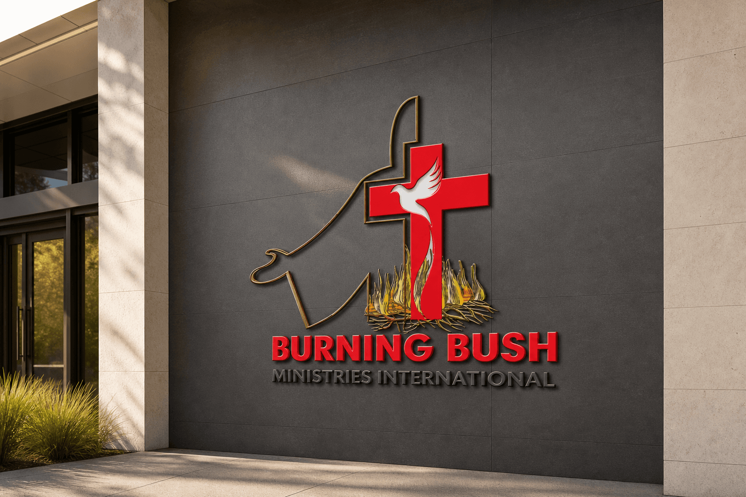
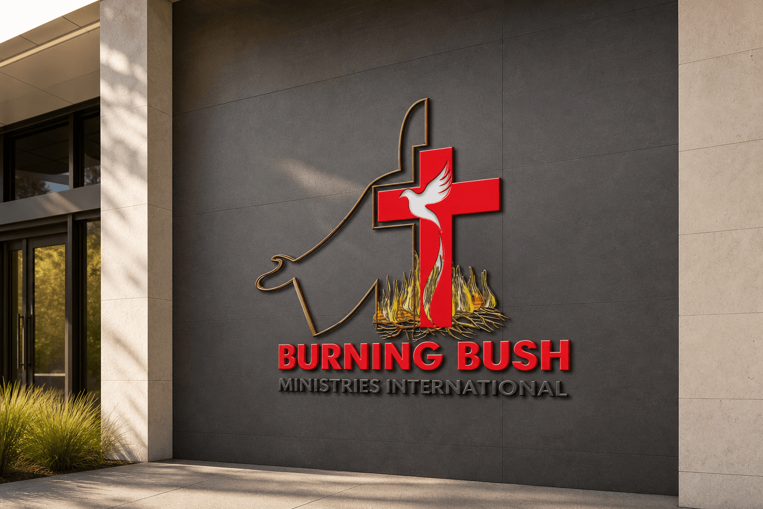
Client and industry overview. This church branding Kenya case study examines Burning Bush Ministries International, whose visible identity combines an outlined worship figure, red cross, white dove, flames, and a two-line wordmark. The source artwork does not establish a precise location, denomination, programme, result, completion date, or delivered collateral.
Objective. This retrospective ministry logo and identity study tests whether the existing mark can stay legible across environmental, wearable, product, stationery, digital, and operational applications relevant to faith-based and community activity.
Design rationale. The cross, dove, and flames create an immediate faith-centered visual sequence. The outlined figure connects those symbols into one compact composition, while the strong red name gives the identity a clear reading point below the detailed mark.
Color and typography. Red carries the main visual emphasis across the cross and organization name. White separates the dove from the cross, black anchors the supporting name line, and restrained gold and flame tones add definition. The bold uppercase wordmark supports visibility at larger and smaller application scales.
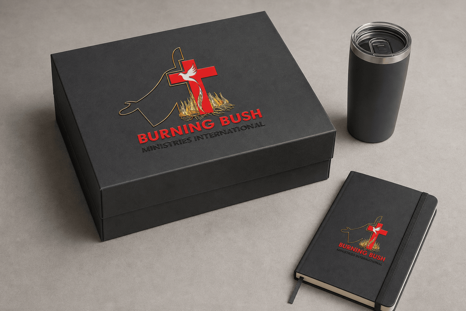
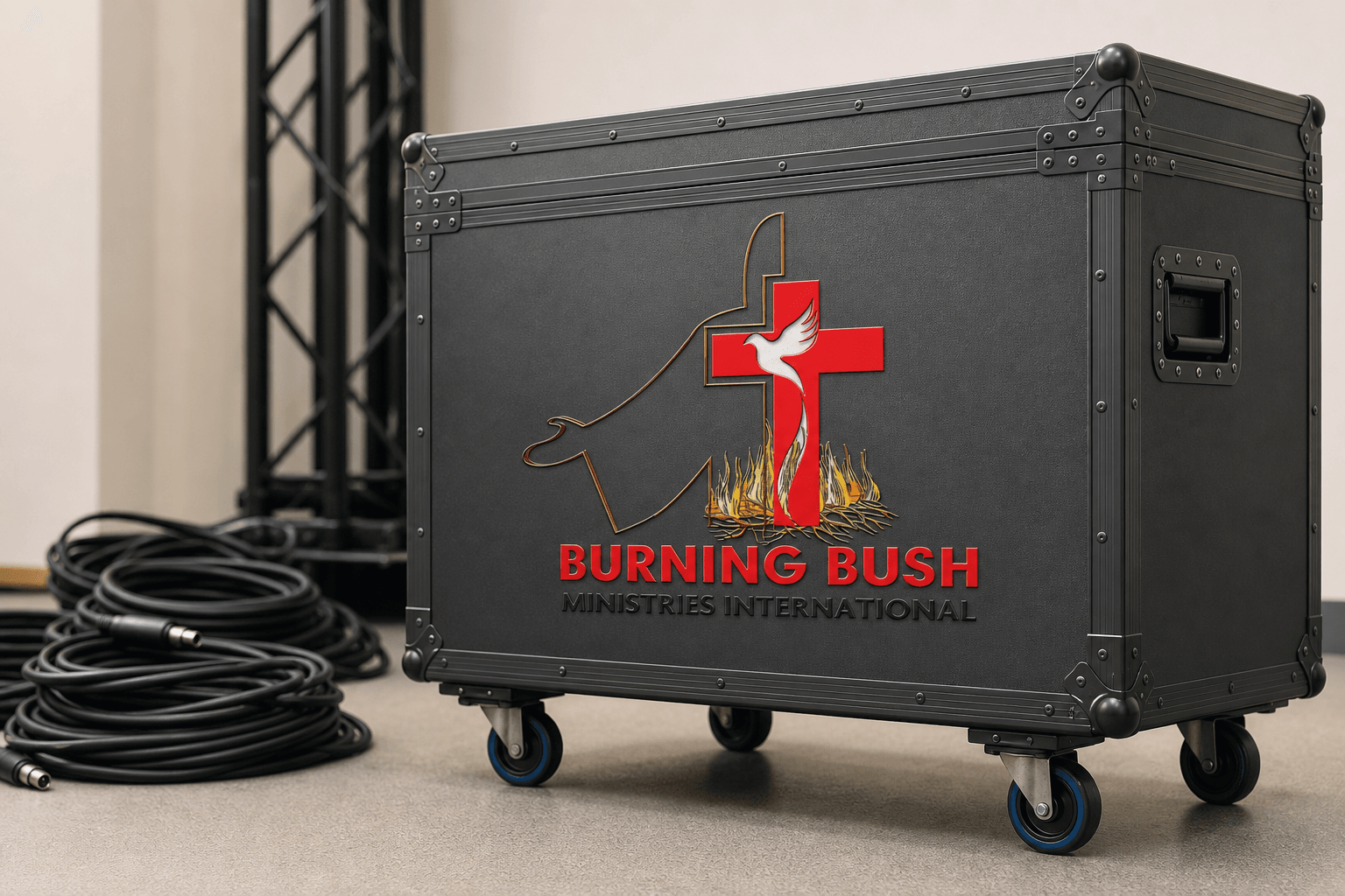
Church branding applications. The ranked concepts cover ministry entrance signage, volunteer apparel, a reusable welcome-materials kit, information folder and digital presentation, and an event equipment case. They are retrospective AI-generated demonstrations of possible use, not proof that Mocky Digital produced or delivered these applications.
Categories. Logo design, visual identity, ministry branding, faith-based organization branding, and brand identity design Kenya.
Let's CollaborateGot a project?
Got a project?
Let's talk.
We're a creative studio who are excited thrilled about distinctive design ideas and helping businesses to create amazing brands by creating top-notch designs and solutions.