Back to Projects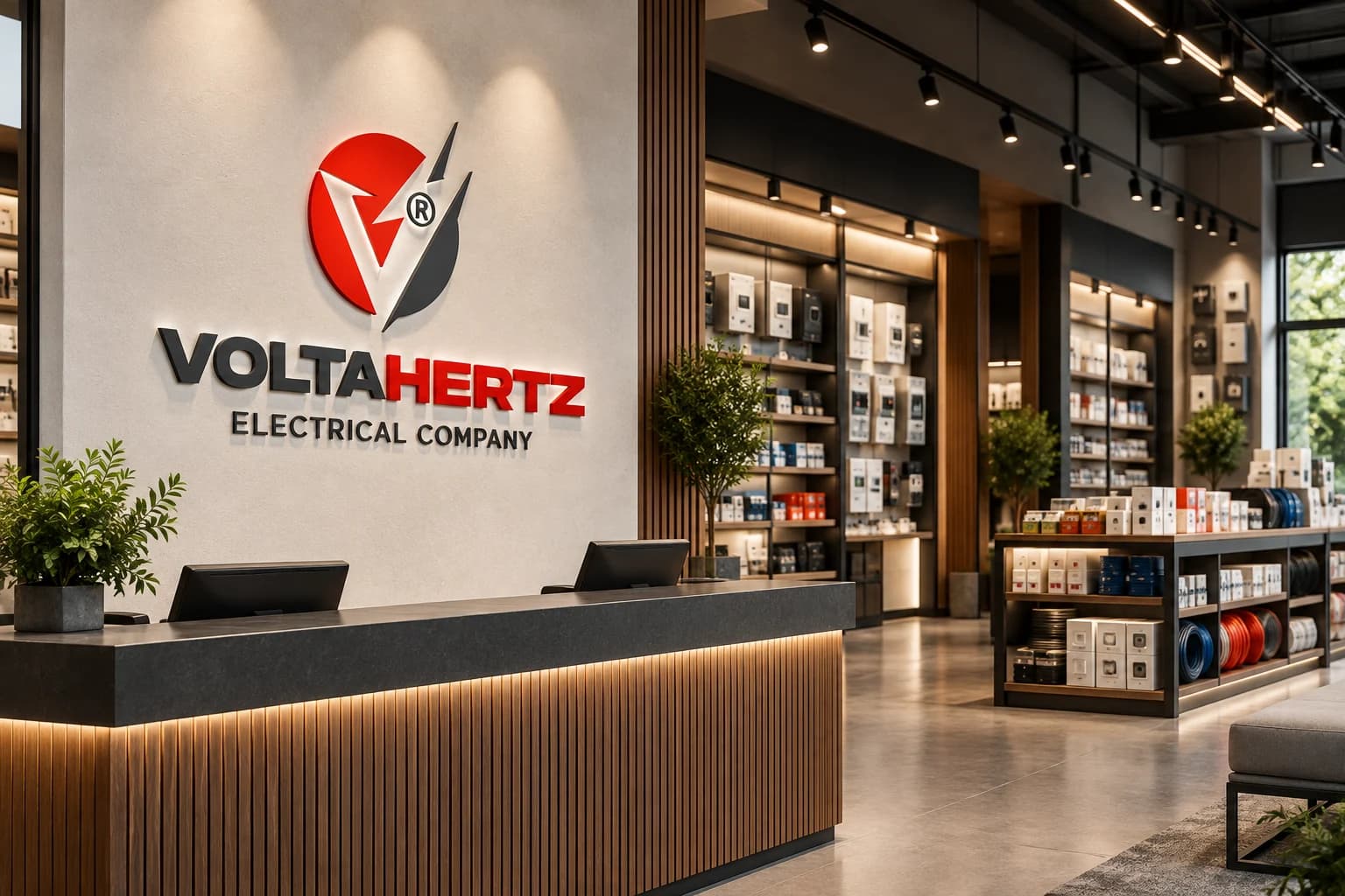
Logo Design / Visual Identity / Electrical Services Branding / Service Business Branding
VoltaHertz Electrical Company Brand Identity
- Client
- VoltaHertz Electrical CompanyElectrical Services Brand
- Industry
- Electrical Services
Task
Demonstrate how an electrical company logo can scale across workshop signage, technician workwear, equipment, proposals, digital presentation, and field operations.
Client and industry overview. VoltaHertz Electrical Company uses a red-and-charcoal lightning symbol, a circular form, a registered mark, and a bold uppercase wordmark. No service territory, certification, project result, completion date, or delivered collateral is asserted because the visible source artwork does not establish those facts.
Objective. This retrospective electrical company logo design Kenya case study tests whether the existing mark can stay clear across the practical settings where an electrical services brand may need recognition.
Design rationale. The circular form provides a compact container, while the opposing lightning shapes communicate energy and movement. The strong horizontal wordmark creates a dependable base beneath the more dynamic symbol.
Color and typography. Red gives the identity urgency and visibility, charcoal adds technical weight, and the white ground maintains contrast. The wide uppercase lettering supports fast reading on signage, workwear, equipment, documents, and vehicles.
Applications. The ranked scenes cover environmental signage, technician apparel, rugged equipment cases, proposal and digital presentation, and a service van. They are retrospective AI-generated demonstrations of possible use, not proof that Mocky Digital produced or delivered these applications.
Categories. Logo design, visual identity, electrical contractor branding, service business branding, and brand identity design Kenya.
The identity in use
Brand applications and concept mockups. Select an image to explore the details.
Build on this work
Need this kind of design for your business?
Review the relevant service scope, starting prices, process, and deliverables before requesting a project quote.
Graphic Design Services in Kenya
Explore graphic design services, prices, deliverables, and the process for starting a project.
Explore serviceCompany Profile Design in Kenya
Create a professional company profile, proposal, annual report, or tender-ready business document.
Explore serviceLogo Design in Kenya
Compare logo-design packages, concepts, revisions, source files, and brand-guideline options.
Explore serviceLet's CollaborateGot a project?
Got a project?
Let's talk.
We're a creative studio who are excited thrilled about distinctive design ideas and helping businesses to create amazing brands by creating top-notch designs and solutions.