Back to Projects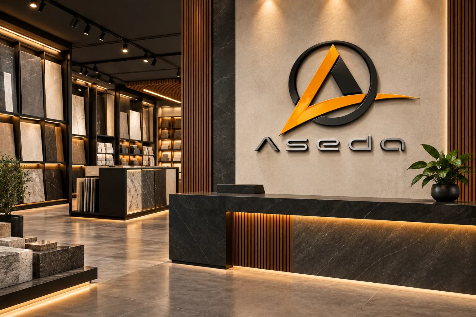
Logo Design / Visual Identity / Building Materials Branding / Supplier Branding
Aseda Building Materials Visual Identity
- Client
- AsedaBuilding Materials and Supplies Brand
- Industry
- Building Materials and Supplies
Task
Demonstrate how a building materials logo can scale across showroom signage, warehouse workwear, delivery packaging, quotation and digital catalog materials, and fleet operations.
Client and industry overview. The Aseda identity combines a circular black structure, an orange angular A and extended stroke, a dark inner triangle, a stylized lowercase wordmark, and the visible line about reliable and quality building materials and supplies. No location, product range, commercial result, completion date, or delivered collateral is asserted beyond what can be read in the source artwork.
Objective. This retrospective building materials logo design Kenya case study tests whether the existing mark can remain clear across customer-facing, staff, packaging, document, digital, and delivery settings.
Design rationale. The angular symbol suggests structure and forward movement, while the circle provides a stable frame. The long orange stroke creates a strong horizontal cue that can carry across signage, vehicles, and document layouts.
Color and typography. Orange provides visibility and energy, black adds weight, and white or neutral surfaces keep the system legible in trade and warehouse environments. The wide geometric lowercase lettering supports a modern, engineered character, while the condensed tagline sits as a functional supporting line.
Applications. The ranked concepts cover showroom reception signage, warehouse workwear, reusable delivery packaging, quotation and digital catalog materials, and a delivery truck. They are retrospective AI-generated demonstrations of possible use, not proof that Mocky Digital produced or delivered these applications.
Categories. Logo design, visual identity, building materials branding, supplier branding, and brand identity design Kenya.
The identity in use
Brand applications and concept mockups. Select an image to explore the details.
Build on this work
Need this kind of design for your business?
Review the relevant service scope, starting prices, process, and deliverables before requesting a project quote.
Graphic Design Services in Kenya
Explore graphic design services, prices, deliverables, and the process for starting a project.
Explore serviceLogo Design in Kenya
Compare logo-design packages, concepts, revisions, source files, and brand-guideline options.
Explore serviceBrand Identity and Branding Services
Build a consistent identity across logos, colours, typography, packaging, stationery, and digital assets.
Explore serviceLet's CollaborateGot a project?
Got a project?
Let's talk.
We're a creative studio who are excited thrilled about distinctive design ideas and helping businesses to create amazing brands by creating top-notch designs and solutions.