Loading Project
Back to Projects
Logo DesignVisual IdentityFood Brand IdentityHospitality Branding
Sirloin Food Identity | Logo Designers Kenya
ClientSirloinMeat-Focused Food Identity
IndustryFood and Hospitality
Task
Demonstrate how the visible Sirloin artwork can remain recognizable across food-counter signage, apparel, packaging, digital ordering, and operational applications.
Client and industry overview. This logo designers Kenya case study examines the visible Sirloin identity, a red, white, and black wordmark paired with a stylized steak symbol and a sweeping red line. The artwork suggests a meat-focused food context, but the source does not establish a location, business model, menu, operating history, results, completion date, or delivered collateral.
Objective. This retrospective food brand identity study tests whether the supplied artwork can remain clear across environmental, wearable, packaging, digital, and operational applications relevant to a food or hospitality setting.
Design rationale. The steak symbol supplies the strongest category cue, while the long red sweep connects it to the wordmark below. The oversized initial S and alternating red and white letterforms create a distinctive rhythm. Small circular details beneath the S add a secondary signature without competing with the name.
Color and typography. Vivid red carries appetite and visibility cues, while white keeps the name legible against the charcoal field. Black outlines and shadows add separation. The high-contrast serif lettering gives the wordmark a formal, established tone, balanced by the simplified food symbol.
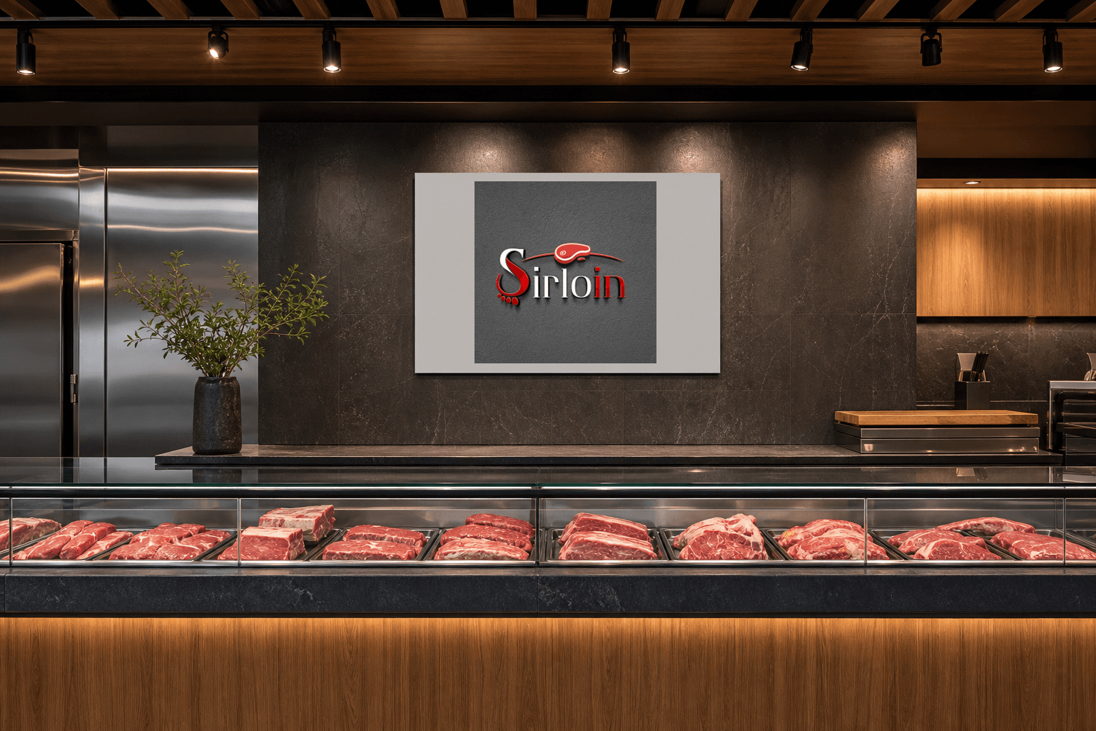
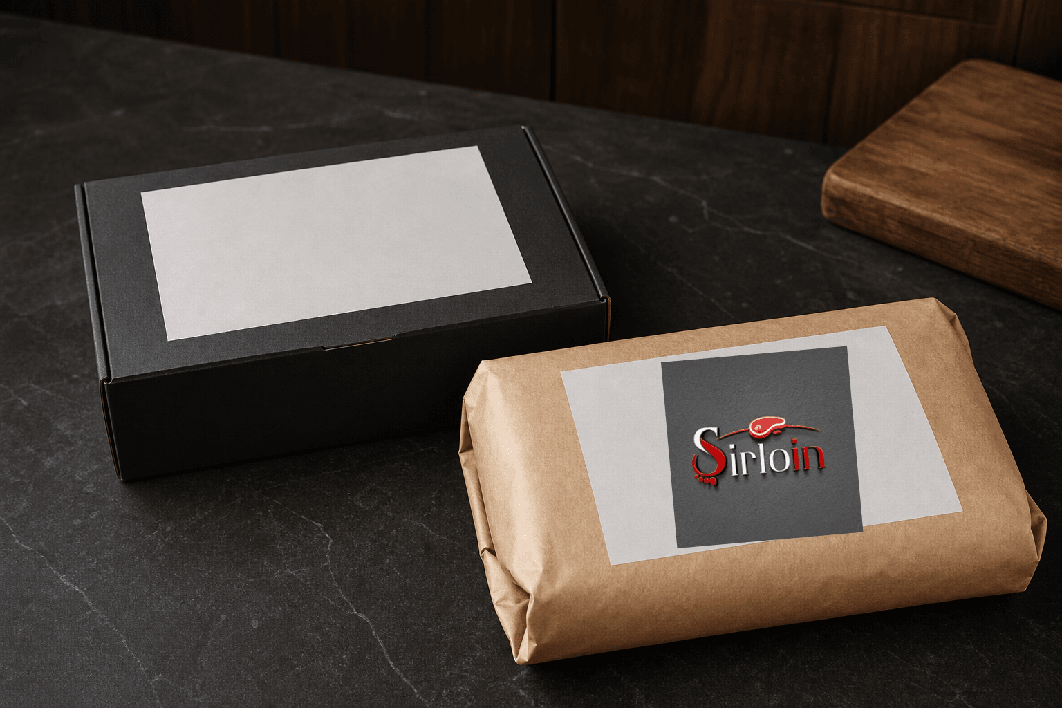
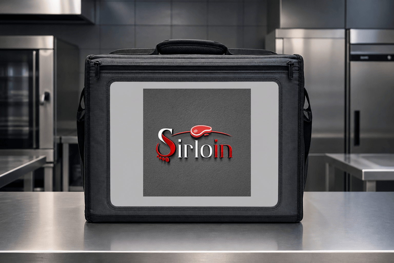
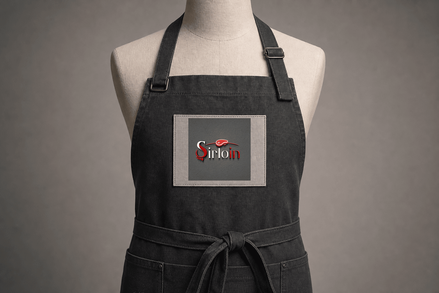
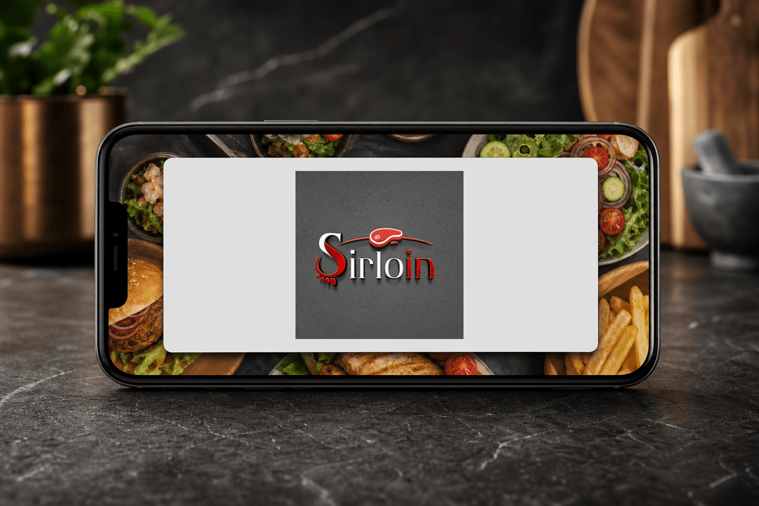
Food brand logo applications. The ranked concepts cover food-counter signage, a service apron, food packaging, a digital ordering welcome screen, and an insulated operations carrier. They are retrospective AI-generated demonstrations of possible use, not proof that Mocky Digital produced or delivered these applications.
Categories. Logo design, visual identity, food brand identity, food packaging branding Kenya, restaurant branding Kenya, and logo designers Kenya.
Build on this work
Need this kind of design for your business?
Review the relevant service scope, starting prices, process, and deliverables before requesting a project quote.
Graphic Design Services in Kenya
Explore graphic design services, prices, deliverables, and the process for starting a project.
Explore serviceLogo Design in Kenya
Compare logo-design packages, concepts, revisions, source files, and brand-guideline options.
Explore serviceBrand Identity and Branding Services
Build a consistent identity across logos, colours, typography, packaging, stationery, and digital assets.
Explore service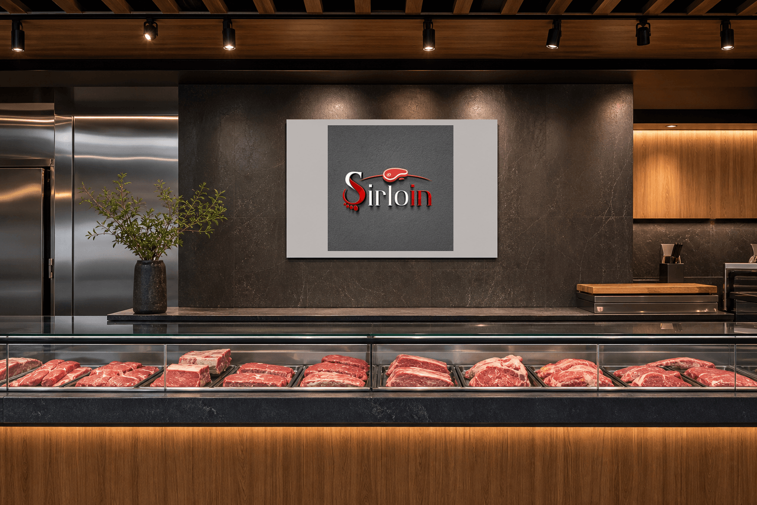
Let's CollaborateGot a project?
Got a project?
Let's talk.
We're a creative studio who are excited thrilled about distinctive design ideas and helping businesses to create amazing brands by creating top-notch designs and solutions.