Loading Project
Back to Projects
Logo DesignVisual IdentitySafari BrandingTour Company Branding
Joyous Touch Safaris Limited | Safari Company Logo Design
ClientJoyous Touch Safaris LimitedSafari and Travel Identity
IndustryTours and Travel
Task
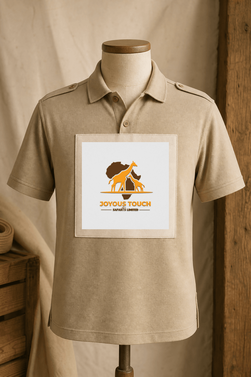
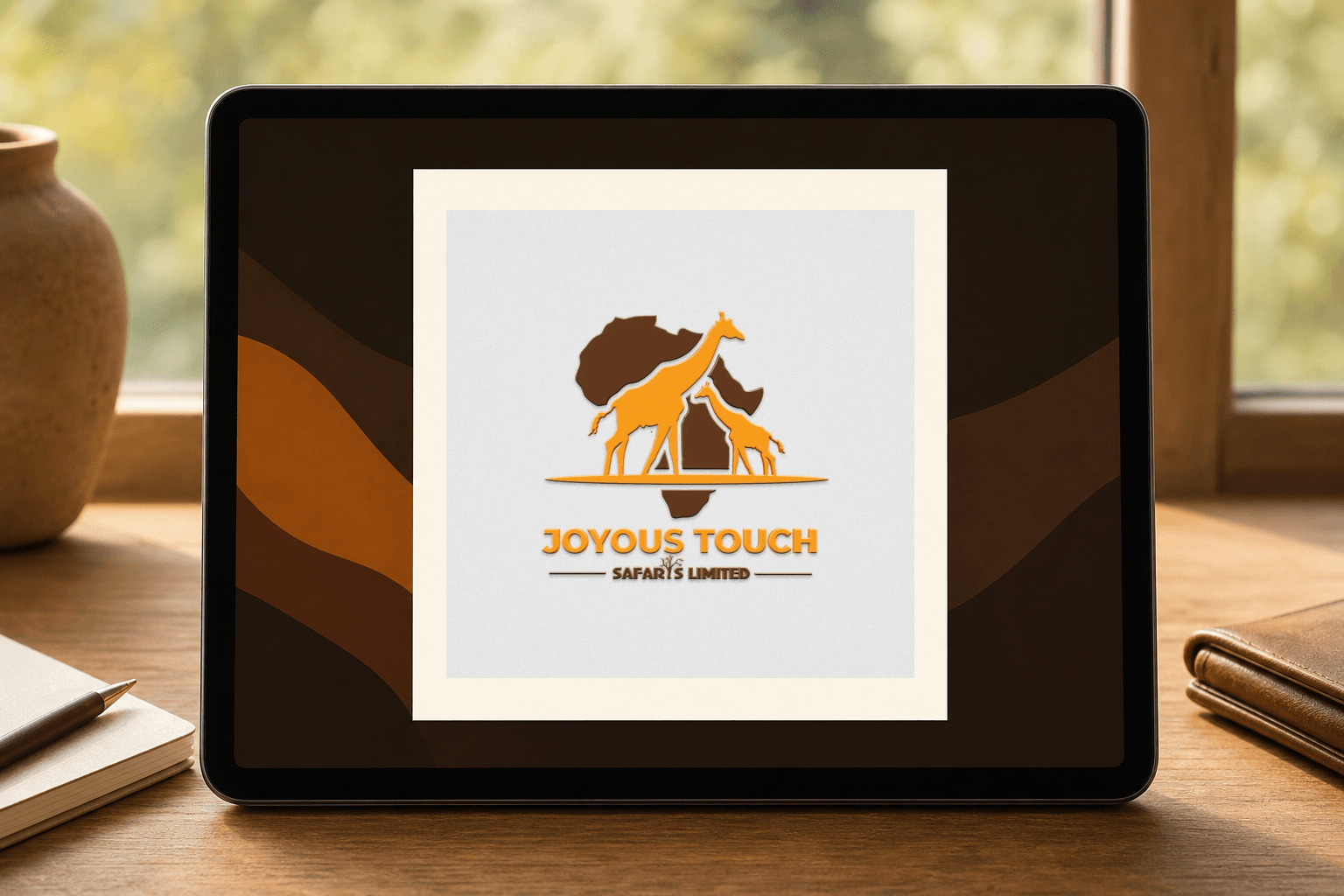
Demonstrate how the visible Joyous Touch Safaris Limited artwork can remain recognizable across reception signage, guide apparel, guest packaging, digital itinerary presentation, and field operations.
Client and industry overview. This safari company logo design case study examines Joyous Touch Safaris Limited, whose visible artwork combines a brown Africa silhouette, two orange giraffes, a grounded horizon line, and a two-level name treatment. The source artwork does not establish a location, tour inventory, operating history, results, completion date, or delivered collateral.
Objective. This retrospective tour company branding study tests whether the supplied identity can stay recognizable across environmental, wearable, packaging, digital, and operational applications relevant to a safari or travel business.
Design rationale. The Africa silhouette establishes a broad travel context, while the two giraffes create the dominant wildlife cue and a clear family grouping. The horizontal base stabilizes the symbol, and the large orange name provides the main reading point below it.
Color and typography. Warm orange leads the palette and creates high visibility against the lighter field. Deep brown adds contrast and anchors the map, supporting line, and smaller details. The bold uppercase client name carries the hierarchy, while the smaller Safaris Limited line provides a restrained second level.
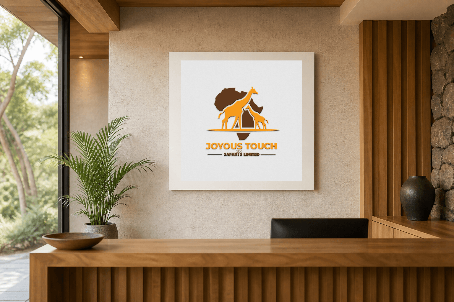
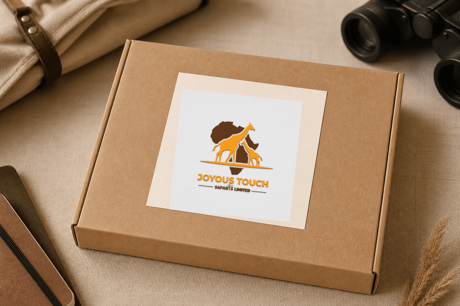
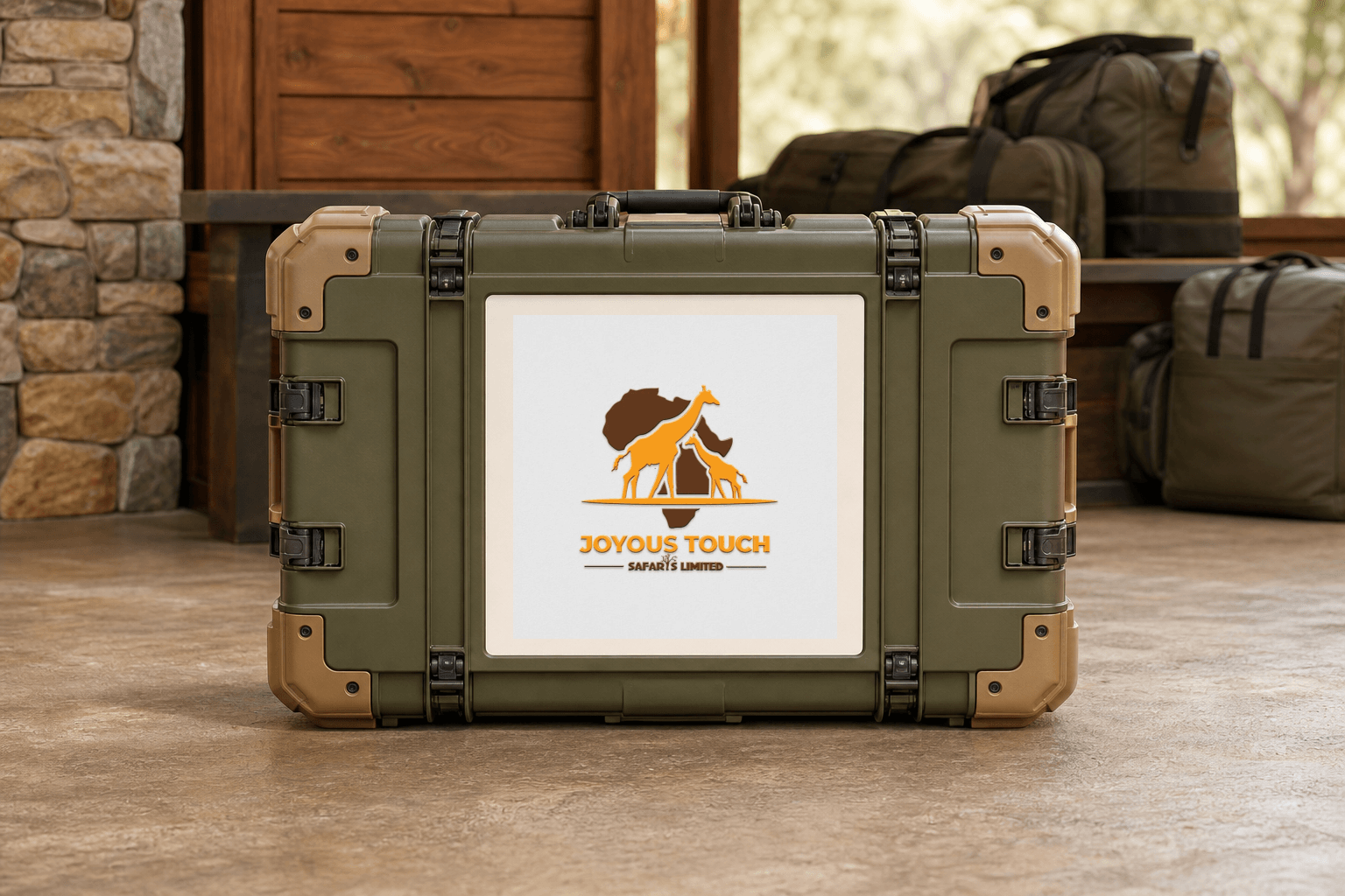
Safari company logo applications. The ranked concepts cover travel-office reception signage, guide field apparel, a guest welcome kit, a digital itinerary welcome screen, and a field equipment case. They are retrospective AI-generated demonstrations of possible use, not proof that Mocky Digital produced or delivered these applications.
Categories. Logo design, visual identity, safari branding, tour company branding, travel logo design Kenya, and brand identity design Kenya.
Build on this work
Need this kind of design for your business?
Review the relevant service scope, starting prices, process, and deliverables before requesting a project quote.
Graphic Design Services in Kenya
Explore graphic design services, prices, deliverables, and the process for starting a project.
Explore serviceLogo Design in Kenya
Compare logo-design packages, concepts, revisions, source files, and brand-guideline options.
Explore serviceBrand Identity and Branding Services
Build a consistent identity across logos, colours, typography, packaging, stationery, and digital assets.
Explore service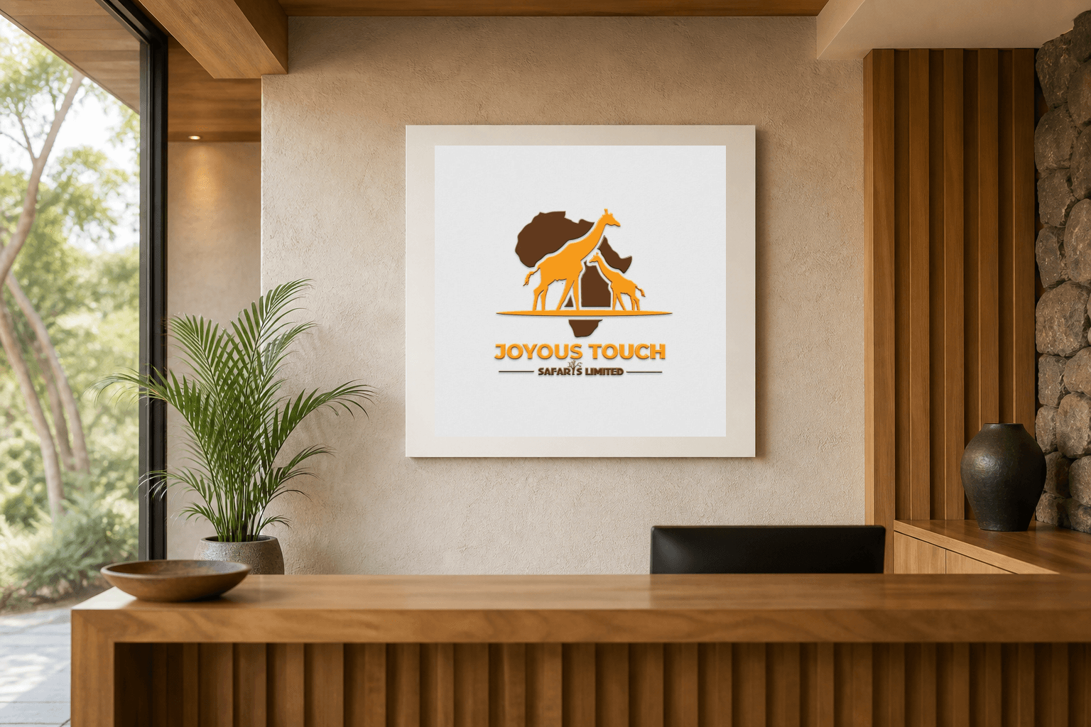
Let's CollaborateGot a project?
Got a project?
Let's talk.
We're a creative studio who are excited thrilled about distinctive design ideas and helping businesses to create amazing brands by creating top-notch designs and solutions.