Typography is the heartbeat of graphic design—the invisible force that transforms simple words into powerful visual communication. For Kenyan businesses and creative professionals navigating the competitive landscape of 2025, mastering typography in graphic design isn't just a technical skill; it's a strategic advantage that can make or break your brand's success.
This essential guide dives deep into the art and science of design typography, covering everything from fundamental principles to advanced techniques that will elevate your creative work. Whether you're designing a brand identity for a Nairobi tech startup or creating marketing materials for an established East African enterprise, these insights will transform how you approach type.
Understanding Typography Fundamentals
Before diving into advanced techniques, it's crucial to establish a solid foundation in typography basics.
What is Typography in Graphic Design?
Typography is the art and technique of arranging type to make written language legible, readable, and visually appealing. It encompasses everything from font selection and sizing to spacing, alignment, and hierarchy. In graphic design, typography serves multiple critical functions:
- Communication:Conveying your message clearly and effectively
- Brand Identity:Establishing distinctive visual personality and recognition
- User Experience:Guiding readers through content with ease and comfort
- Emotional Impact:Creating specific moods, feelings, and associations
- Visual Hierarchy:Organizing information by importance and relationship
For businesses investing in professionalbranding services, typography choices are fundamental decisions that influence how customers perceive and interact with your brand.
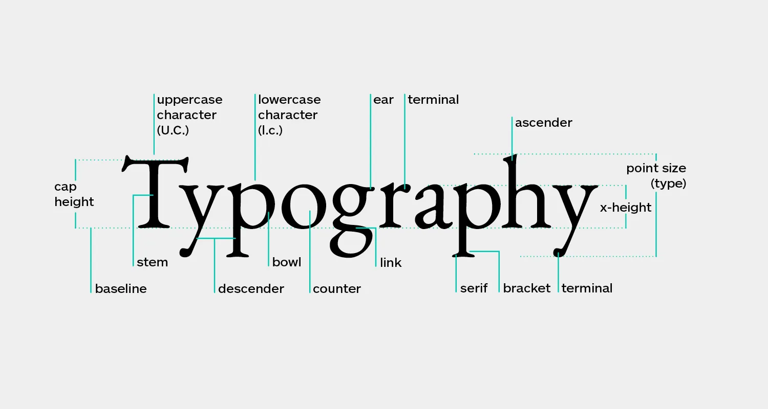
Key Typography Terms Every Designer Should Know
Understanding the language of typography is essential:
- Typeface vs. Font:A typeface is the design (e.g., Helvetica), while a font is a specific style within that typeface (e.g., Helvetica Bold 12pt)
- Serif vs. Sans-serif:Serif fonts have decorative strokes at letter ends; sans-serif fonts are cleaner without these embellishments
- Kerning:The space between individual letter pairs
- Tracking:The overall spacing between all letters in a word or line
- Leading:The vertical space between lines of text
- Hierarchy:The visual organization of text elements by importance
- X-height:The height of lowercase letters, excluding ascenders and descenders
- Baseline:The invisible line on which letters sit
The Psychology of Font Selection
Every typeface carries psychological associations and communicates subliminal messages about your brand. Understanding these associations is crucial for effective graphic design typography.
Serif Fonts: Tradition and Authority
Serif fonts like Times New Roman, Garamond, and Georgia convey:
- Tradition, reliability, and respectability
- Formality and established authority
- Classic elegance and sophistication
- Trust and credibility
Best Uses:Legal firms, financial institutions, educational organizations, luxury brands, editorial content, and long-form reading materials.
Sans-serif Fonts: Modernity and Clarity
Sans-serif fonts like Helvetica, Futura, and Open Sans communicate:
- Modernity, innovation, and forward-thinking
- Simplicity and minimalism
- Approachability and friendliness
- Clean, contemporary aesthetics
Best Uses:Tech companies, startups, contemporary brands, digital interfaces, mobile applications, and brands targeting younger demographics.
Script Fonts: Elegance and Personality
Script and handwritten fonts suggest:
- Elegance, sophistication, and luxury
- Personal touch and human connection
- Creativity and artistic expression
- Femininity and refinement
Best Uses:Wedding services, beauty brands, restaurants, creative studios, and brands emphasizing personal service or handcrafted quality.
Display Fonts: Impact and Uniqueness
Decorative and display fonts communicate:
- Bold personality and distinctiveness
- Creativity and unconventional thinking
- Specific themes or concepts
- High impact and attention-grabbing qualities
Best Uses:Headlines, logos, posters, event branding, and situations where maximum impact is needed (always use sparingly).
Font Pairing: The Art of Combination
One of the most challenging aspects of typography in graphic design is selecting fonts that work harmoniously together. Successful font pairing creates visual interest while maintaining cohesion and readability.
Fundamental Principles of Font Pairing
1. Create Contrast, Not Conflict
Effective font pairs should be distinctly different yet complementary. Common contrast strategies include:
- Serif + Sans-serif:The classic pairing that almost always works (e.g., Playfair Display with Open Sans)
- Thick + Thin:Combining bold, heavy fonts with lighter, more delicate options
- Tall + Short:Pairing fonts with different x-heights for visual interest
- Geometric + Organic:Structured fonts with more flowing, natural alternatives
2. Limit Your Font Choices
Professional designers typically use no more than 2-3 typefaces in a single project:
- Two Fonts:One for headlines/display, one for body text (most common and safest approach)
- Three Fonts:Display/headline, subheadings, body text (use with caution and expertise)
- More than Three:Almost always creates visual chaos and unprofessional appearance
3. Establish Clear Hierarchy
Font pairing works best when there's obvious differentiation in roles:
- Primary Font:Eye-catching, personality-driven, used for headlines and key messaging
- Secondary Font:Highly readable, neutral, used for body copy and supporting content
- Accent Font (if used):Special applications like pull quotes, captions, or calls-to-action
4. Consider Font Families
Using different weights and styles within a single typeface family is a foolproof approach:
- Avoids clashing aesthetics
- Maintains visual cohesion
- Still provides adequate contrast through weight and style variations
- Examples: Roboto (Thin, Regular, Bold, Black), Montserrat (Light, Regular, SemiBold, ExtraBold)
Proven Font Pairing Formulas for 2025
Formula 1: Classic Editorial
- Headline: Playfair Display (Serif)
- Body: Source Sans Pro (Sans-serif)
- Use Case: Blogs, magazines, editorial content, professional services
Formula 2: Modern Minimalist
- Headline: Montserrat Bold (Sans-serif)
- Body: Lato Regular (Sans-serif)
- Use Case: Tech startups, contemporary brands, digital products
Formula 3: Elegant Luxury
- Headline: Bodoni (Serif)
- Body: Futura (Sans-serif)
- Use Case: Fashion, luxury goods, high-end services
Formula 4: Friendly Approachable
- Headline: Quicksand (Rounded Sans-serif)
- Body: Open Sans (Sans-serif)
- Use Case: Healthcare, education, community organizations, family-oriented brands
When developinglogo designsand comprehensive brand identities, establishing clear font pairing rules ensures consistency across all touchpoints.
Typography Hierarchy: Guiding the Reader's Eye
Typography hierarchy is the system of organizing text elements to show their relative importance and guide readers through content effectively.
The Six Levels of Typography Hierarchy
Level 1: Primary Headline (H1)
- Largest and most prominent text element
- Should capture attention immediately
- Typically 2.5-3x the size of body text
- Often uses display or distinctive fonts
- Limited to one per page/design
Level 2: Secondary Headlines (H2)
- Section headers that break up content
- Approximately 2x body text size
- Creates scannable content structure
- Should be visually distinct from H1 but related
Level 3: Subheadings (H3)
- Subsection headers within major sections
- Approximately 1.5x body text size
- Often uses weight variation rather than dramatic size change
- Maintains readability while providing organization
Level 4: Body Text
- The foundation of your content
- Highly readable font at comfortable size (16-18px for web, 10-12pt for print)
- Generous line spacing (1.4-1.6 line height for web)
- Optimal line length (50-75 characters per line)
Level 5: Supporting Text
- Captions, image descriptions, side notes
- Slightly smaller than body text (14-15px for web)
- Often uses lighter weight or different color to differentiate
- Provides context without competing with main content
Level 6: Fine Print
- Legal disclaimers, copyright notices, footnotes
- Smallest text size while maintaining legibility
- Should never be so small it's difficult to read
- Often uses muted colors or reduced opacity
Visual Techniques for Creating Hierarchy
Beyond size, designers use multiple techniques to establish hierarchy:
- Weight:Bold for emphasis, light for de-emphasis
- Color:Vibrant colors draw attention, muted colors recede
- Spacing:Generous space around important elements increases prominence
- Position:Top and left positions naturally draw attention first
- Alignment:Centered text feels formal and important; left-aligned feels natural for body text
- Case:ALL CAPS demands attention (use sparingly); Title Case for importance; sentence case for approachability
Readability Principles: Making Typography Functional
Beautiful typography is worthless if people can't read it comfortably. These principles ensure your designs are both aesthetic and functional.
Optimal Line Length
The ideal line length for comfortable reading is 50-75 characters per line (approximately 10-12 words). Lines that are too long cause eye fatigue; lines too short create choppy, interrupted reading.
Implementation strategies:
- Use responsive containers that limit maximum width
- Adjust column layouts for different content types
- Consider multi-column layouts for print materials
Line Height (Leading)
Proper spacing between lines dramatically improves readability:
- Body Text:1.4-1.6x the font size (e.g., 16px text with 24px line height)
- Headlines:1.1-1.3x the font size (tighter spacing for impact)
- Small Text:1.5-1.8x the font size (more space helps legibility)
Letter Spacing (Tracking)
While most fonts are designed with optimal default spacing, adjustments are sometimes necessary:
- Headlines:Often benefit from slightly tighter tracking (-20 to -50)
- All Caps:Always increase tracking (+50 to +200) for readability
- Small Text:May need slight increase (+10 to +30) for clarity
- Body Text:Rarely needs adjustment from default
Color Contrast
Sufficient contrast between text and background is essential:
- WCAG Standards:Minimum 4.5:1 ratio for normal text, 3:1 for large text
- Best Practice:Aim for 7:1 or higher for optimal accessibility
- Tools:Use contrast checker tools to verify ratios
- Context Matters:Consider how lighting conditions affect readability
Alignment Best Practices
- Left-aligned:Most readable for Western languages; natural reading flow
- Centered:Formal and elegant; works for short text blocks and headlines
- Right-aligned:Unusual and attention-grabbing; use sparingly
- Justified:Clean edges but can create awkward spacing; requires hyphenation
Professionalgraphic design servicesalways prioritize readability alongside aesthetic considerations, ensuring your message is both beautiful and accessible.
Typography in Branding: Creating Distinctive Identities
Typography is often the most recognizable element of a brand identity, sometimes even more memorable than logos or color schemes.
Building Typography-Driven Brand Systems
1. Establish Primary Brand Fonts
Select typefaces that embody your brand personality:
- Should reflect brand values and positioning
- Must work across all applications (print, digital, signage)
- Should include multiple weights and styles for flexibility
- Must be properly licensed for commercial use
- Consider custom fonts for ultimate distinctiveness
2. Create Typography Guidelines
Document clear rules for consistent application:
- Approved font families and specific weights
- Size relationships and hierarchy standards
- Spacing specifications (tracking, leading, margins)
- Color applications and contrast requirements
- Do's and don'ts with visual examples
- Alternative fonts for special situations
3. Apply Consistently Across Touchpoints
Typography should be recognizable whether customers encounter your brand:
- Website and digital interfaces
- Social media posts and advertisements
- Business cards and stationery
- Product packaging and labels
- Signage and environmental graphics
- Marketing collateral and presentations
Case Studies: Effective Typography in Kenyan Context
Safari and Tourism Brands:Often combine adventurous display fonts with elegant serifs to balance excitement with sophistication, reflecting both wildlife adventure and luxury hospitality.
Fintech Startups:Typically use modern, geometric sans-serif fonts that communicate innovation, security, and technological advancement—critical associations for financial trust.
Local Food and Beverage:Many successful Kenyan F&B brands use friendly, approachable typography that feels authentic and locally rooted while maintaining professional quality.
Creative Agencies:Often showcase typography as a key differentiator, using distinctive, character-rich fonts that demonstrate design expertise and creative thinking.
Whether you're building a brand from scratch or refreshing an existing identity, working with experiencedbranding professionalsensures your typography choices support long-term business goals.
Common Typography Mistakes to Avoid
Even experienced designers sometimes fall into these typography traps. Awareness is your best defense.
1. Too Many Fonts
The Problem:Using four or more different typefaces creates visual chaos and unprofessional appearance.
The Solution:Limit to 2-3 fonts maximum, or explore variations within a single font family.
2. Poor Contrast
The Problem:Light gray text on white backgrounds, or insufficient differentiation between text and background.
The Solution:Always verify contrast ratios; when in doubt, go darker for better readability.
3. Insufficient Leading
The Problem:Lines of text too close together create dense, uninviting text blocks.
The Solution:Use 1.4-1.6 line height for body text; test with actual content, not lorem ipsum.
4. Overusing Decorative Fonts
The Problem:Script or display fonts used for body text become illegible and exhausting to read.
The Solution:Reserve decorative fonts for headlines and small doses; prioritize readability for body content.
5. Ignoring Kerning Issues
The Problem:Awkward letter spacing, especially in headlines and logos, looks unprofessional.
The Solution:Manually adjust kerning in important text elements; pay special attention to letter combinations like WA, To, AV.
6. Stretching or Distorting Type
The Problem:Artificially expanding or compressing fonts destroys their designed proportions.
The Solution:If you need wider or narrower type, select a font designed with those proportions; never stretch fonts.
7. Center-aligning Long Text
The Problem:Center-aligned paragraphs are difficult to read because each line starts at a different position.
The Solution:Use center alignment only for short text blocks; left-align body copy.
8. Insufficient Font Licensing
The Problem:Using fonts without proper commercial licenses exposes businesses to legal risk.
The Solution:Always verify licensing terms; invest in properly licensed fonts or use reputable free alternatives like Google Fonts.
9. Neglecting Mobile Typography
The Problem:Text that looks perfect on desktop becomes illegible on mobile devices.
The Solution:Test all designs on actual mobile devices; use responsive typography that adjusts appropriately.
10. Sacrificing Legibility for Style
The Problem:Prioritizing aesthetic trends over functional readability.
The Solution:Remember that typography's primary purpose is communication; beauty should enhance, not compromise, this function.
Typography Tools and Resources for 2025
Essential Software
- Adobe Creative Suite:Industry-standard tools (Illustrator, InDesign, Photoshop) for professional typography work
- Figma:Collaborative design platform with excellent typography features for digital projects
- Sketch:Popular among UI/UX designers for interface typography
- Canva:Accessible tool for basic typography projects and social media graphics
Font Resources
- Google Fonts:Free, open-source fonts with excellent quality and web optimization
- Adobe Fonts:Included with Creative Cloud subscription; vast library of premium typefaces
- Font Squirrel:Free fonts for commercial use with clear licensing
- MyFonts/Fonts.com:Premium marketplace for professional typeface licenses
Typography Tools
- Type Scale:Generate harmonious type size systems
- Font Pair:Find complementary font combinations
- WhatFont:Browser extension to identify fonts on websites
- Contrast Checker:Verify accessibility compliance
- Kern Type:Game for practicing kerning skills
Learning Resources
- Typewolf:Typography inspiration and font recommendations
- Fonts In Use:Real-world typography examples and case studies
- Practical Typography:Comprehensive online typography guide
- Typography courses:Skillshare, LinkedIn Learning, Coursera offerings
Typography Trends for 2025 and Beyond
While timeless principles should guide your core typography decisions, awareness of current trends helps keep your designs fresh and relevant.
Current Typography Trends
- Variable Fonts:Single font files containing multiple variations, offering unprecedented flexibility and performance
- Bold, Oversized Headlines:Commanding attention in increasingly crowded digital spaces
- Organic, Imperfect Typography:Hand-drawn elements that add warmth and authenticity
- Kinetic Typography:Animated text effects for digital experiences and social media
- Maximalist Mixing:Confident combinations of multiple type styles (for experienced designers only)
- Retro Revival:70s, 80s, and 90s typography aesthetics reimagined for contemporary applications
- Accessibility-First Design:Growing emphasis on inclusive, universally readable typography
Balancing Trends with Timelessness
The most successful brands use trends selectively:
- Core brand typography should be relatively timeless
- Campaign and seasonal materials can embrace current trends
- Social media content offers safe spaces for trend experimentation
- Always prioritize function and clarity over trendy aesthetics
Implementing Typography in Web Development
Digital typography presents unique challenges and opportunities compared to print design.
Web Font Loading Strategies
- System Fonts:Instant loading but limited design options
- Web Fonts:Greater design flexibility with loading considerations
- Font Display Properties:Control how text appears during font loading
- Subsetting:Include only necessary characters to reduce file size
- Font Preloading:Prioritize critical font loading for better performance
Responsive Typography
Modern websites require typography that adapts across devices:
- Fluid Typography:Font sizes that scale smoothly with viewport width
- Viewport Units:Using vw units for responsive scaling
- Media Queries:Specific typography adjustments at breakpoints
- Clamp() Function:CSS function for setting min, ideal, and max font sizes
Performance Considerations
- Font file sizes impact page load speed
- Limit web font variations to necessary weights and styles
- Use modern font formats (WOFF2) for optimal compression
- Consider system font stacks as fallbacks
Professionalweb development servicesensure typography is both beautiful and performant, creating optimal user experiences across all devices.
Conclusion: Typography as Strategic Asset
Typography in graphic design is far more than selecting attractive fonts—it's a strategic discipline that directly impacts how your audience perceives, engages with, and remembers your brand. From the fundamental principles of readability to the nuanced art of font pairing, every typography decision shapes the user experience and communicates your brand values.
For Kenyan businesses competing in local and global markets, mastering design typography offers distinct competitive advantages:
- Professional Credibility:Thoughtful typography signals quality and attention to detail
- Brand Recognition:Distinctive typography creates memorable visual identities
- Improved Communication:Clear hierarchy and readability ensure your message resonates
- Emotional Connection:Typography psychology influences how audiences feel about your brand
- Accessibility:Inclusive typography expands your reach and demonstrates social responsibility
As we navigate 2025 and beyond, the fundamentals remain constant while tools and techniques continue evolving. Variable fonts offer new creative possibilities. Accessibility standards become increasingly important. Performance optimization ensures beautiful typography doesn't compromise user experience. Cultural sensitivity grows in importance as brands speak to diverse, global audiences.
Whether you're a designer refining your craft or a business leader investing in brand development, understanding typography principles empowers better decisions. The difference between amateur and professional design often comes down to typography execution—those subtle refinements in spacing, hierarchy, and font selection that most people don't consciously notice but everyone subconsciously feels.
Start applying these principles today. Audit your current typography choices against the standards outlined in this guide. Experiment with font pairings using the proven formulas provided. Test your designs for readability across devices and contexts. Document your typography decisions in clear guidelines that ensure consistency.
Remember: exceptional typography isn't about following every trend or using the most exotic fonts. It's about making thoughtful, strategic choices that serve your content, support your brand, and respect your audience. It's about finding that perfect balance between aesthetic beauty and functional clarity.
Ready to elevate your brand with professional typography and comprehensive design services? The team at Mocky Digital specializes in creating distinctive visual identities that help Kenyan businesses stand out and succeed. From strategicbranding developmentto expertgraphic design, we bring typography expertise and creative excellence to every project. Let's create something extraordinary together.