Loading Project
Back to Projects
Logo DesignVisual IdentityCommunity BrandingNGO Branding
WAPI Visual Identity
ClientWar Against Poverty Initiative (WAPI)Community Initiative
IndustryCommunity and Social Impact
Task
Present a community-focused identity that remains recognizable across outreach, volunteer, reporting, field-material, and environmental applications.
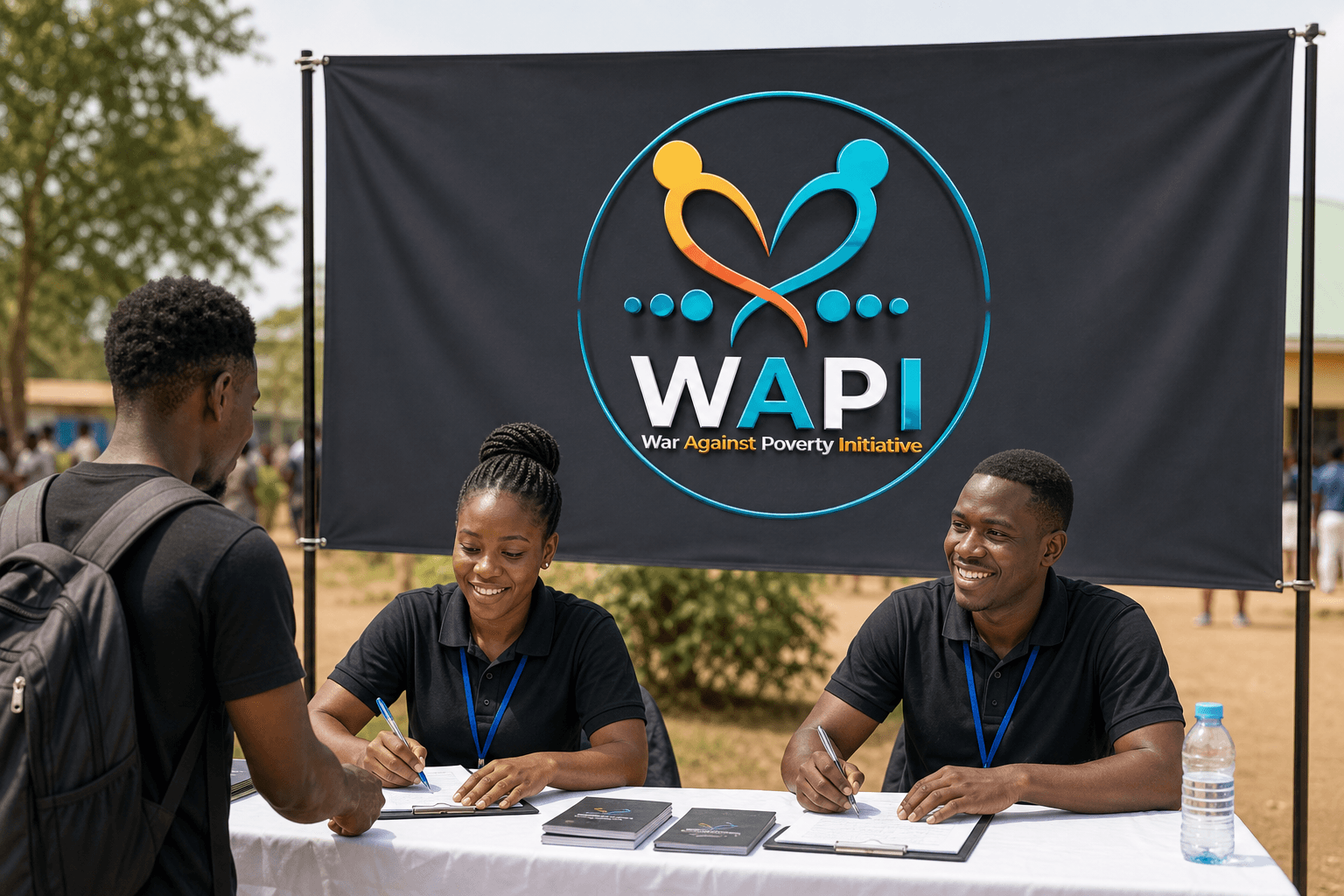
The visible WAPI identity centers on two abstract human figures whose crossing forms create a heart-like gesture. The symbol supports a message of people, care, and shared action without relying on unverified program claims. Cyan, orange-yellow, white, and charcoal create strong contrast, while the circular frame makes the mark suitable for badges, signage, and compact applications. The uppercase sans-serif initials provide a firm anchor beneath the more expressive symbol.
This retrospective visual-identity showcase explores possible applications across community outreach, volunteer apparel, field reporting, practical materials, and directional signage. The generated scenes demonstrate how the supplied logo could behave in use. They are not evidence that these exact items were part of the original engagement.
Build on this work
Need this kind of design for your business?
Review the relevant service scope, starting prices, process, and deliverables before requesting a project quote.
Graphic Design Services in Kenya
Explore graphic design services, prices, deliverables, and the process for starting a project.
Explore serviceLogo Design in Kenya
Compare logo-design packages, concepts, revisions, source files, and brand-guideline options.
Explore serviceBrand Identity and Branding Services
Build a consistent identity across logos, colours, typography, packaging, stationery, and digital assets.
Explore service


Let's CollaborateGot a project?
Got a project?
Let's talk.
We're a creative studio who are excited thrilled about distinctive design ideas and helping businesses to create amazing brands by creating top-notch designs and solutions.