Back to Projects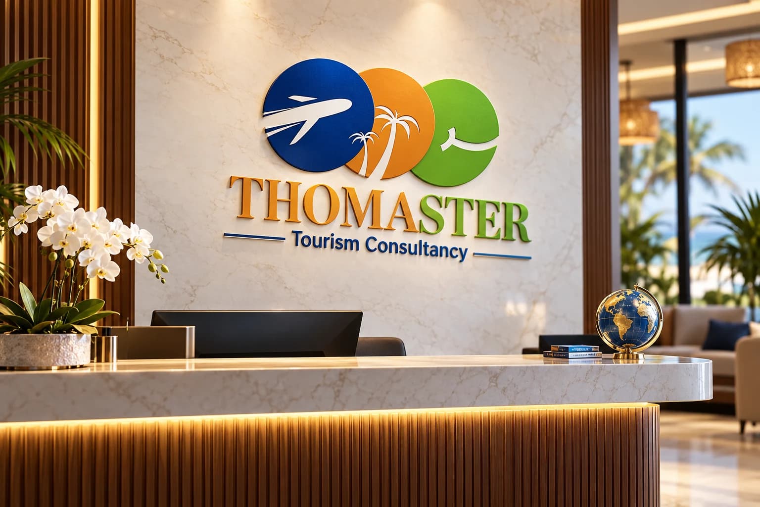
Logo Design / Visual Identity / Tourism Branding / Travel Branding
Thomaster Tourism Consultancy Visual Identity
- Client
- Thomaster Tourism ConsultancyTourism Consultancy Brand
- Industry
- Tourism and Travel
Task
Demonstrate a travel identity across office, team, documentation, guest pickup, and digital planning touchpoints.
Thomaster Tourism Consultancy uses an interlocking travel symbol with an aircraft, palms, and a curved route form. Blue, orange, green, and sky blue give the identity an energetic travel palette. For buyers comparing branding companies in Nairobi, the case study illustrates how a logo system can connect a service environment with practical guest-facing moments.
The applications are retrospective AI-generated demonstrations of possible use, not proof that these exact items formed part of the original engagement.
The identity in use
Brand applications and concept mockups. Select an image to explore the details.
Build on this work
Need this kind of design for your business?
Review the relevant service scope, starting prices, process, and deliverables before requesting a project quote.
Graphic Design Services in Kenya
Explore graphic design services, prices, deliverables, and the process for starting a project.
Explore serviceLogo Design in Kenya
Compare logo-design packages, concepts, revisions, source files, and brand-guideline options.
Explore serviceBrand Identity and Branding Services
Build a consistent identity across logos, colours, typography, packaging, stationery, and digital assets.
Explore serviceLet's CollaborateGot a project?
Got a project?
Let's talk.
We're a creative studio who are excited thrilled about distinctive design ideas and helping businesses to create amazing brands by creating top-notch designs and solutions.