Back to Projects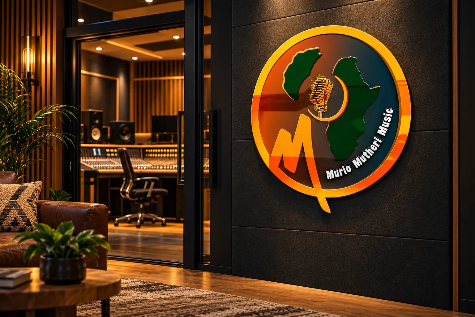
Logo Design / Visual Identity / Music Branding / Entertainment Branding
Murio Mutheri Music Visual Identity
- Client
- Murio Mutheri MusicMusic Brand
- Industry
- Music and Entertainment
Task
Demonstrate how a music logo can remain recognizable across studio signage, performance apparel, release packaging, streaming interfaces, and production equipment.
Client and industry overview. Murio Mutheri Music uses a circular identity combining an African continent silhouette, a vintage microphone, an energetic orange M form, and the visible name Murio Mutheri Music. No location, audience, catalogue, performance result, completion date, or delivered collateral is asserted because the source artwork does not establish those facts.
Objective. This retrospective music logo design Kenya case study explores whether the existing identity can stay distinctive across physical, wearable, packaged, digital, and operational music touchpoints.
Design rationale. The microphone creates an immediate music reference, while the Africa silhouette provides a strong geographic visual idea without claiming a specific operating location. The circular border holds the detailed elements together, and the angular M adds movement at the base of the composition.
Color and typography. Orange and gold create warmth and energy, green anchors the map forms, and the dark background gives the bright elements contrast. The curved white lettering follows the circular structure and keeps the brand name integrated with the symbol.
Applications. The ranked concepts cover studio reception signage, performance apparel, vinyl release packaging, a streaming profile, and a production flight case. They are retrospective AI-generated demonstrations of possible use, not proof that Mocky Digital produced or delivered these applications.
Categories. Logo design, visual identity, music branding, entertainment brand identity, and graphic design services.
The identity in use
Brand applications and concept mockups. Select an image to explore the details.
Build on this work
Need this kind of design for your business?
Review the relevant service scope, starting prices, process, and deliverables before requesting a project quote.
Graphic Design Services in Kenya
Explore graphic design services, prices, deliverables, and the process for starting a project.
Explore serviceLogo Design in Kenya
Compare logo-design packages, concepts, revisions, source files, and brand-guideline options.
Explore serviceBrand Identity and Branding Services
Build a consistent identity across logos, colours, typography, packaging, stationery, and digital assets.
Explore serviceLet's CollaborateGot a project?
Got a project?
Let's talk.
We're a creative studio who are excited thrilled about distinctive design ideas and helping businesses to create amazing brands by creating top-notch designs and solutions.