Loading Project
Back to Projects
Logo DesignVisual IdentityTavern BrandingHospitality Branding
Harry's Tavern | Tavern Logo Design Kenya
ClientHarry's TavernTavern and Hospitality Brand
IndustryHospitality
Task
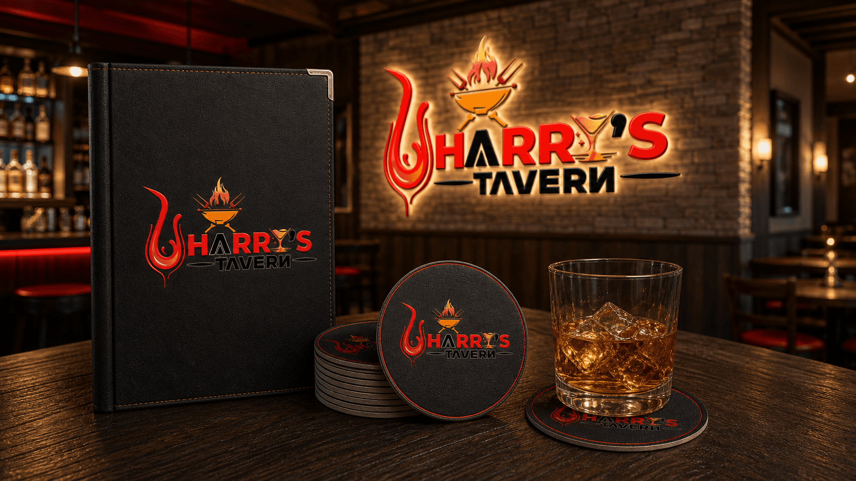
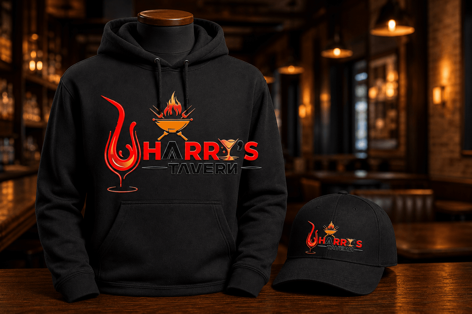
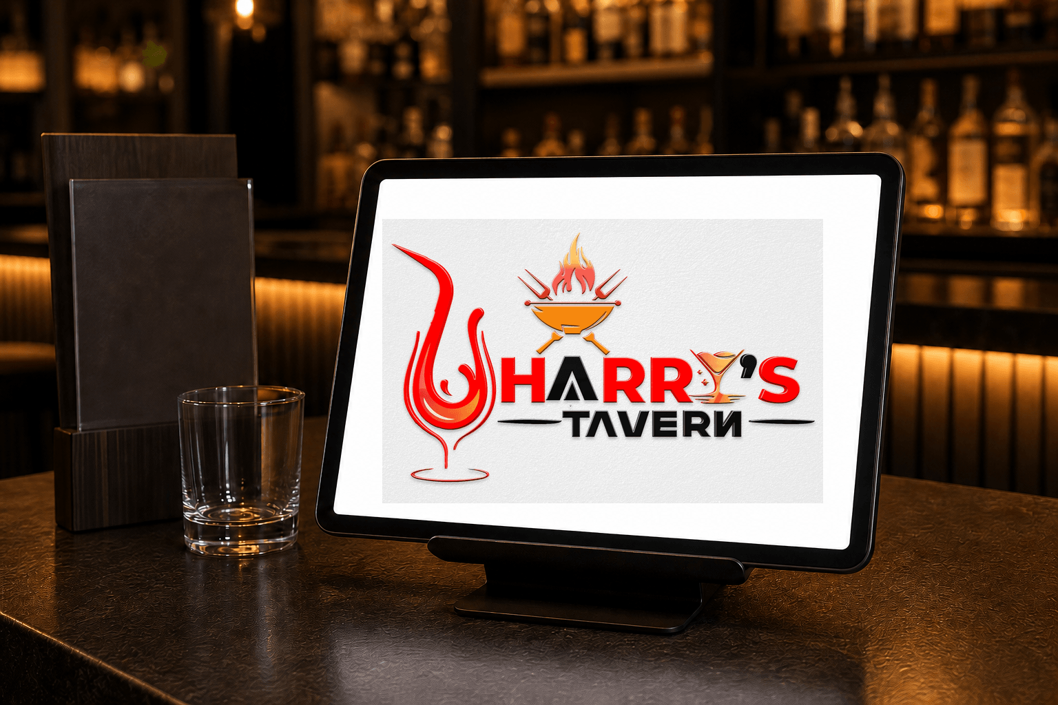
Demonstrate how the visible Harry's Tavern identity can remain recognizable across venue signage, menu and coaster presentation, apparel, service merchandise, digital reservations, and event operations.
Client and industry overview. This tavern logo design Kenya case study examines Harry's Tavern, whose visible identity combines a red glass outline, flame, grill, utensils, drink symbol, bold name, and black supporting wordmark. The source artwork does not establish a location, menu, event programme, result, completion date, or delivered collateral.
Objective. This retrospective hospitality identity study tests whether the existing mark can stay recognizable across environmental, wearable, product, stationery, digital, and operational applications relevant to a tavern or social venue.
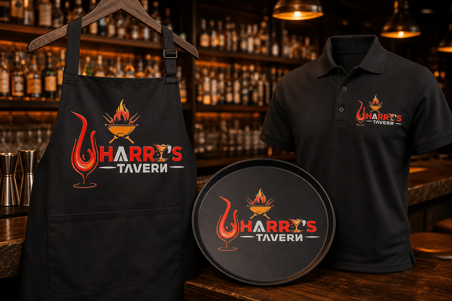
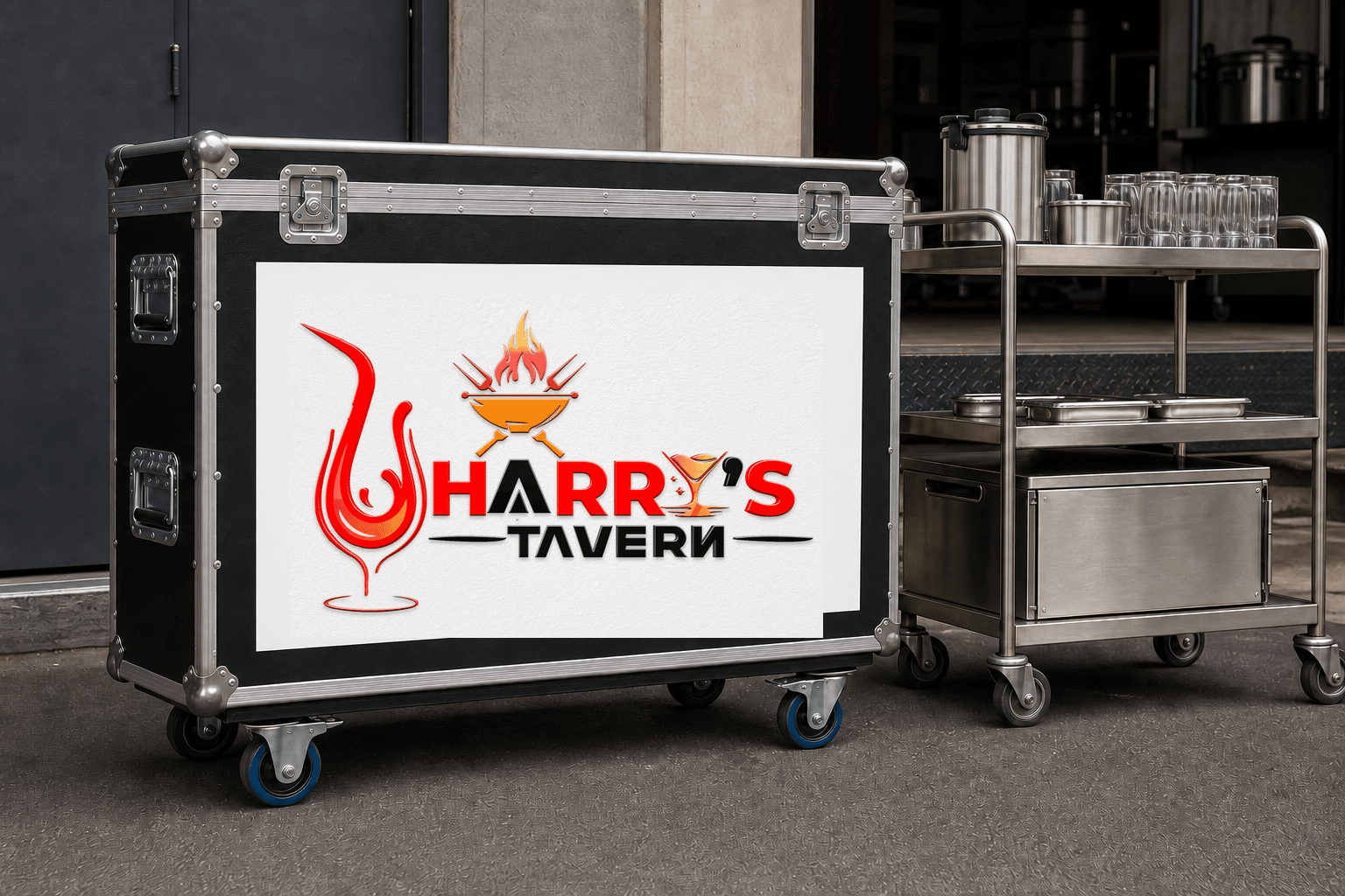
Design rationale. The glass outline creates the largest silhouette and connects visually with the smaller drink symbol inside the name. Flame, grill, and utensil cues suggest food and social hospitality, while the bold uppercase lettering supports visibility in a busy venue setting.
Color and typography. Red provides the strongest identity cue through the glass form and main name. Amber adds warmth to the grill and drink symbols, black anchors the supporting wordmark, and the light background maintains separation across the detailed composition. Heavy uppercase lettering gives the name a direct, high-visibility reading point.
Tavern identity applications. The ranked concepts cover signage, menu and coaster presentation, coordinated apparel, a staff service kit, a tablet reservation welcome screen, and an event-service flight case. They are retrospective AI-generated demonstrations of possible use, not proof that Mocky Digital produced or delivered these applications.
Categories. Logo design, visual identity, tavern logo design Kenya, hospitality branding, venue branding, and brand identity design Kenya.
Build on this work
Need this kind of design for your business?
Review the relevant service scope, starting prices, process, and deliverables before requesting a project quote.
Graphic Design Services in Kenya
Explore graphic design services, prices, deliverables, and the process for starting a project.
Explore serviceLogo Design in Kenya
Compare logo-design packages, concepts, revisions, source files, and brand-guideline options.
Explore serviceBrand Identity and Branding Services
Build a consistent identity across logos, colours, typography, packaging, stationery, and digital assets.
Explore service



Let's CollaborateGot a project?
Got a project?
Let's talk.
We're a creative studio who are excited thrilled about distinctive design ideas and helping businesses to create amazing brands by creating top-notch designs and solutions.