Loading Project
Back to Projects
Logo DesignVisual IdentityCoaching Brand IdentityProfessional Development Branding
Bright Move Coaching Identity | Coaching Logo Design
ClientBright Move CoachingCoaching and Professional Development Identity
IndustryCoaching and Professional Development
Task
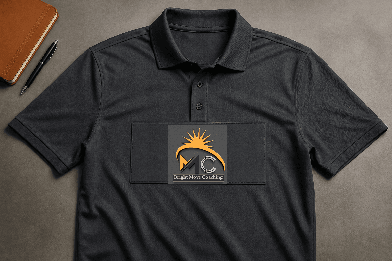
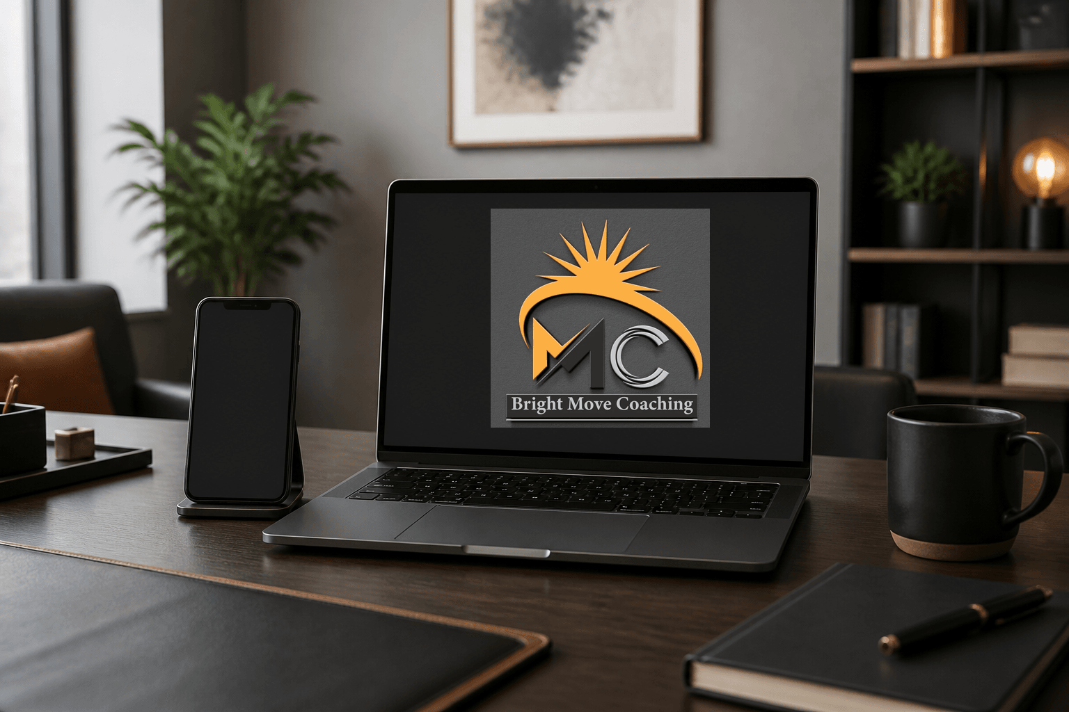
Demonstrate how the visible Bright Move Coaching artwork can remain recognizable across office signage, facilitator apparel, coaching materials, digital welcome, and workshop-equipment applications.
Client and industry overview. This coaching logo design case study examines the visible Bright Move Coaching identity. The artwork combines the initials MC with an upward-moving orange arc and radiating sun form above the company name. These cues suggest movement, visibility, and development, but the source does not establish a location, coaching specialty, programme, audience, credentials, results, completion date, or delivered collateral.
Objective. This retrospective coaching brand identity study tests whether the complete supplied artwork can remain clear across environmental, wearable, product, digital, and operational applications relevant to professional development communication.
Design rationale. The rising arc and sun form create the dominant sense of direction, while the angular M and metallic C give the centre of the mark a compact monogram structure. The visual system suggests forward motion without supporting any claim about outcomes or client transformation.
Color and typography. Amber-orange creates the strongest contrast against the charcoal field, while black, silver, and white give the monogram and nameplate a dimensional finish. The serif company name remains part of the complete supplied artwork and is retained exactly in every application.
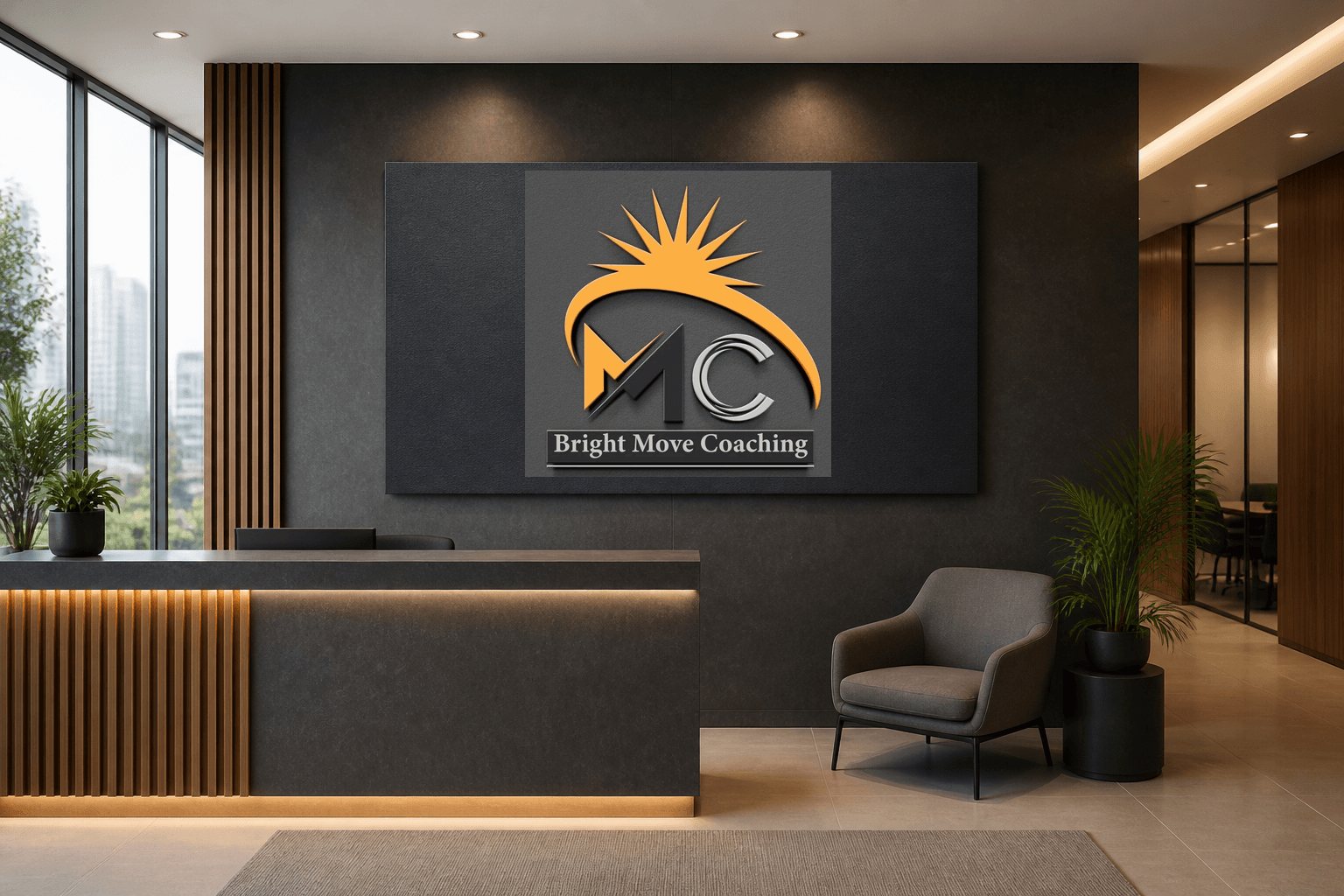
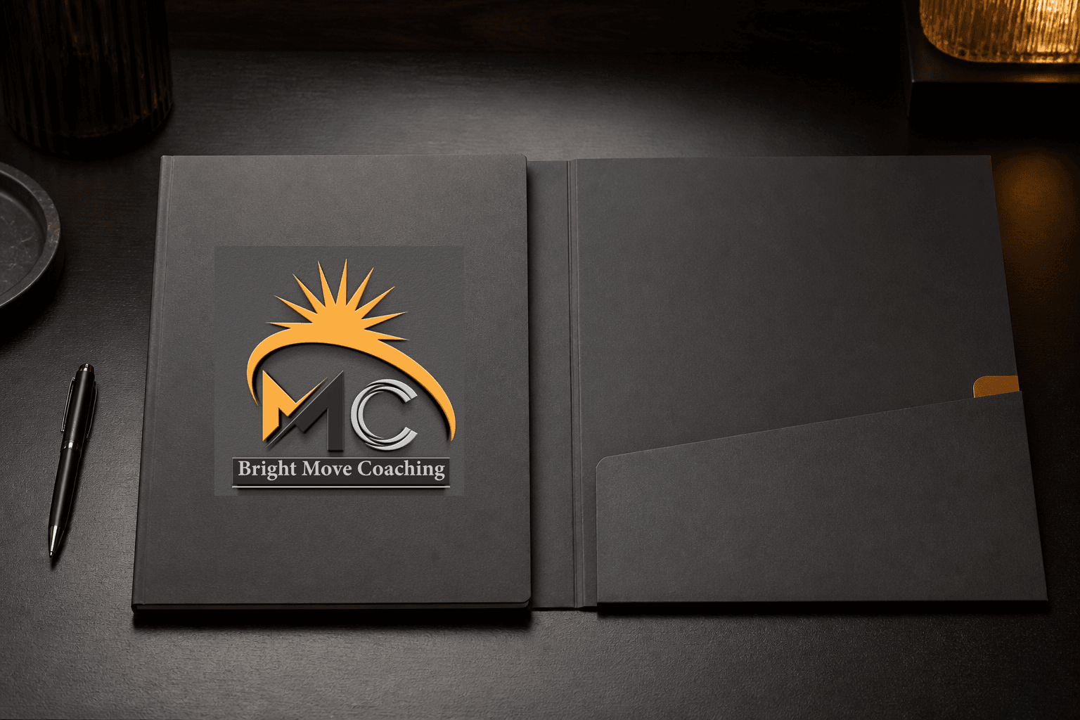
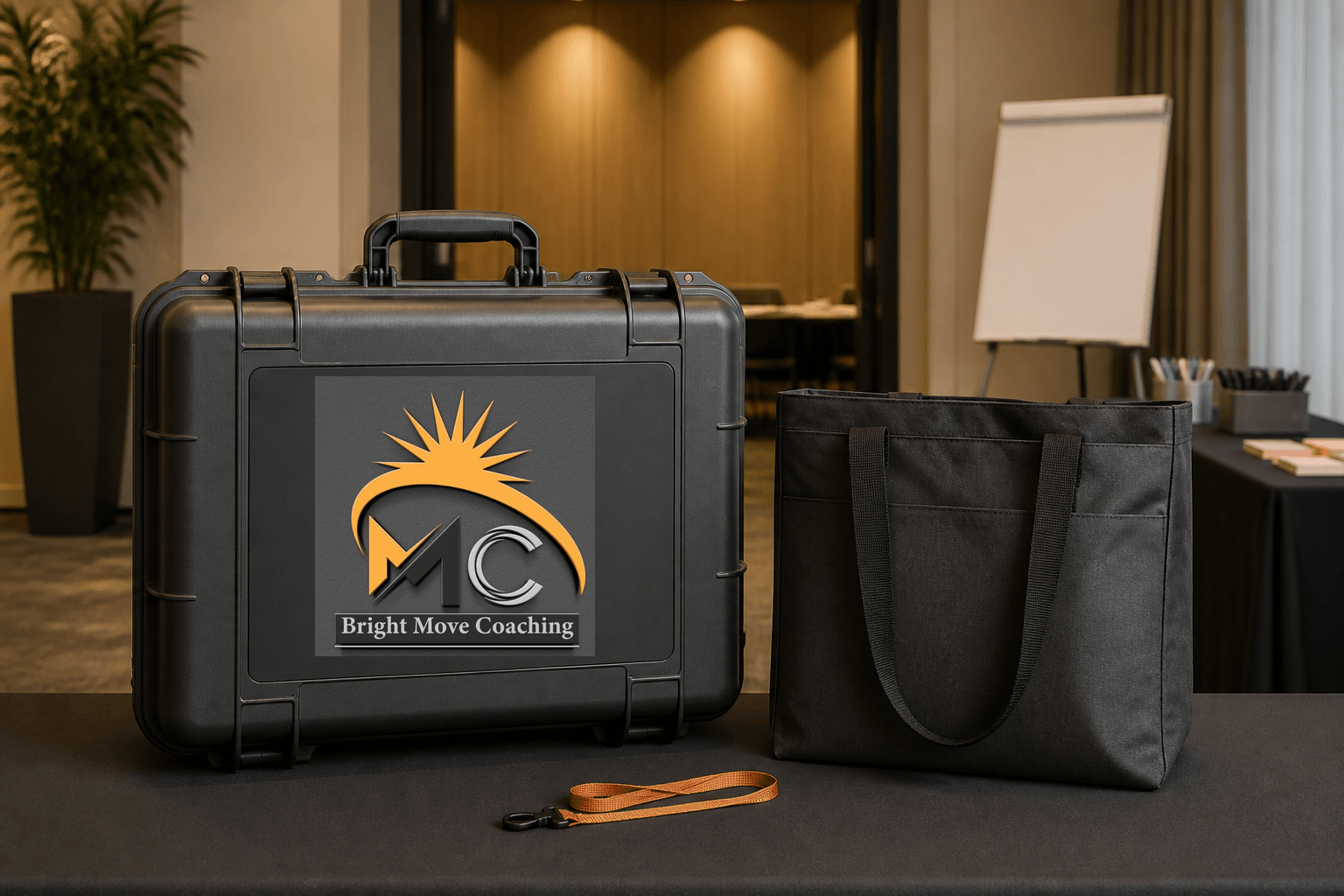
Coaching logo applications. The ranked concepts cover coaching-office signage, facilitator apparel, a coaching workbook kit, a digital coaching welcome screen, and a workshop equipment case. They are retrospective AI-generated demonstrations of possible use, not proof that Mocky Digital produced or delivered these applications.
Categories. Logo design, visual identity, coaching brand identity, professional development branding, and coaching logo design.
Build on this work
Need this kind of design for your business?
Review the relevant service scope, starting prices, process, and deliverables before requesting a project quote.
Graphic Design Services in Kenya
Explore graphic design services, prices, deliverables, and the process for starting a project.
Explore serviceLogo Design in Kenya
Compare logo-design packages, concepts, revisions, source files, and brand-guideline options.
Explore serviceBrand Identity and Branding Services
Build a consistent identity across logos, colours, typography, packaging, stationery, and digital assets.
Explore service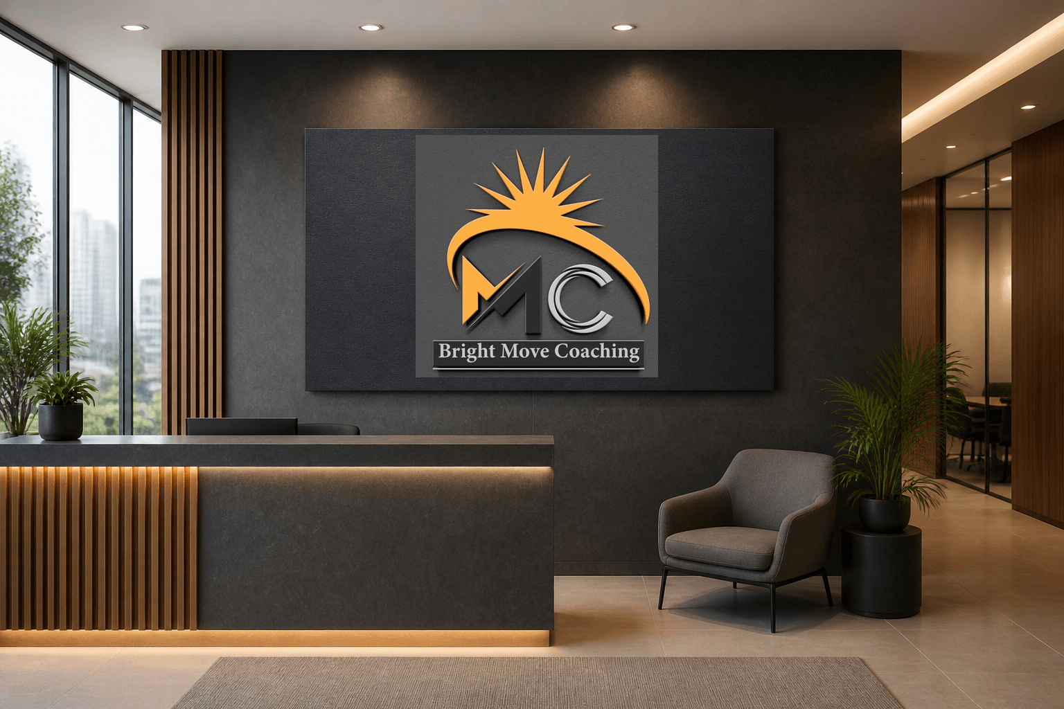
Let's CollaborateGot a project?
Got a project?
Let's talk.
We're a creative studio who are excited thrilled about distinctive design ideas and helping businesses to create amazing brands by creating top-notch designs and solutions.